
How to Choose Website Color Schemes
Selecting the right color scheme for your website is crucial as it can significantly impact user experience, brand perception, and overall aesthetics. Here’s a step-by-step guide to help you choose the ideal color scheme for your website.
1. Understand Color Theory
Primary, Secondary, and Tertiary Colors
- Primary Colors: Red, blue, and yellow. These colors cannot be made by mixing other colors.
- Secondary Colors: Green, orange, and purple. These are created by mixing primary colors.
- Tertiary Colors: These are made by mixing primary and secondary colors.
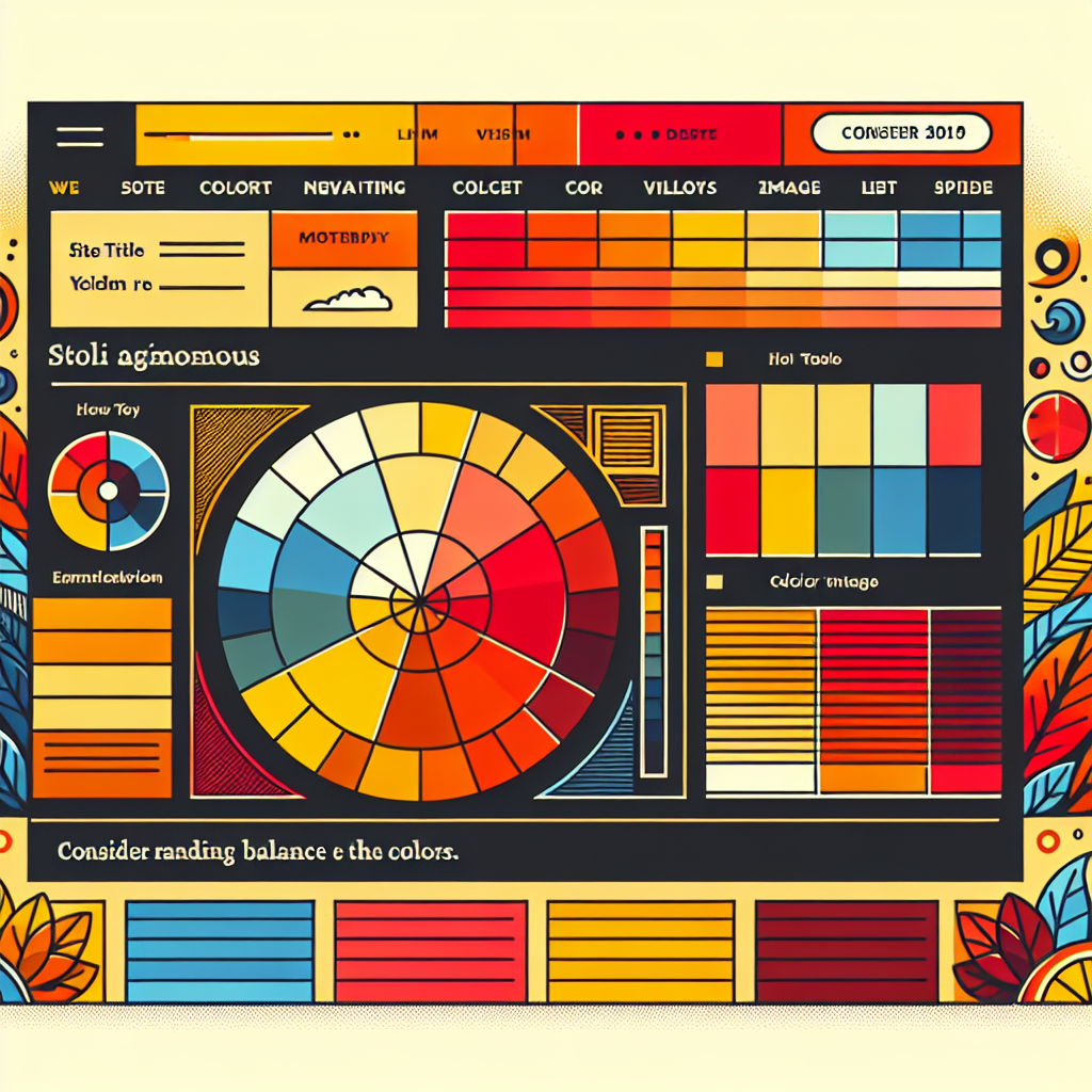
Color Wheel
A color wheel helps visualize the relationships between colors. Complementary colors (opposite each other on the wheel) and analogous colors (next to each other on the wheel) are common choices for color schemes.
2. Define Your Brand Identity
Your website colors should align with your brand’s identity. Ask yourself:
- What emotions do you want to evoke?
- What colors represent your brand values?
For instance, blue often signifies trust and professionalism, making it a popular choice for corporate websites.
3. Consider Your Audience
Think about your target audience. Different colors can have different psychological impacts depending on cultural and personal preferences. For example:
- Younger audiences may prefer vibrant and energetic colors.
- Professional audiences may lean towards more subdued and classic tones.
4. Analyze Competitors
Look at your competitors’ websites to see what color schemes they are using. This can give you an idea of industry standards and help you differentiate your brand.
5. Choose a Base Color
Select a primary color that will be the foundation of your color scheme. This color should be dominant and reflect your brand’s personality.
6. Create a Color Palette
Monochromatic Scheme
A monochromatic scheme uses different shades and tints of a single color. This creates a cohesive and elegant look.
Analogous Scheme
An analogous scheme uses colors that are next to each other on the color wheel. This scheme is harmonious and pleasing to the eye.
Complementary Scheme
A complementary scheme uses colors that are opposite each other on the color wheel. This creates a vibrant and dynamic look.
Triadic Scheme
A triadic scheme uses three colors that are evenly spaced on the color wheel. This provides a balanced and versatile palette.
7. Test for Accessibility
Ensure that your color scheme is accessible to all users, including those with color blindness. Use tools like the WebAIM Contrast Checker to verify that your text and background colors have sufficient contrast.
8. Consistency is Key
Maintain consistency across your website by using your chosen color scheme for all elements, including buttons, links, and headers. This creates a cohesive and professional appearance.
9. Gather Feedback
Before finalizing your color scheme, gather feedback from colleagues, stakeholders, or even potential users. This can provide valuable insights and help you make informed decisions.
10. Stay Updated
Design trends evolve, so it’s essential to stay updated with the latest trends in color schemes. However, always prioritize your brand identity and user experience over fleeting trends.
By following these steps, you can create a visually appealing and effective color scheme for your website that resonates with your audience and reinforces your brand identity. Happy designing!